Using modelling paste with glitter
Hello everyone,
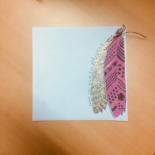
Do you ever look at a crafty product and immediately know how you will be using it? I recently had this feeling when I bought Craftreat feathers stencil. It has 3 feathers, one simple one and 2 designs to go with the basic feather.
Here is the card I made:
What I did was I used Little Birdie Mixed media paste to get some wet embossing through the stencil, and OMG the design looked breathtaking. Contrary to my expectation, the leafy pattern looked better than the detailed one. But I was happy nonetheless. So, I sprinkled some silver and black glitter over the wet embossing and voila, it looked so pretty!
I hand wrote the sentiment. The key is to stay natural while writing such stuff because the more you try to fake it to look like Monotype Corsiva or Times New Roman, the more messy looking writing you will get.
I hope you like my effort. Thanks for stopping by.
Have a lovely day!
Sweety
Linking this to:
1. CAS Game #111: Use only 1/3: I have used just 1/3rd of my panel. It limits the space that I have to work on while making the card more elegant.

2. Muse Challenge #258: I loved how the black sort of shines/contrasts against the green. I tried to do the same with pink and black in my card.

Do you ever look at a crafty product and immediately know how you will be using it? I recently had this feeling when I bought Craftreat feathers stencil. It has 3 feathers, one simple one and 2 designs to go with the basic feather.
Here is the card I made:
What I did was I used Little Birdie Mixed media paste to get some wet embossing through the stencil, and OMG the design looked breathtaking. Contrary to my expectation, the leafy pattern looked better than the detailed one. But I was happy nonetheless. So, I sprinkled some silver and black glitter over the wet embossing and voila, it looked so pretty!
I hand wrote the sentiment. The key is to stay natural while writing such stuff because the more you try to fake it to look like Monotype Corsiva or Times New Roman, the more messy looking writing you will get.
I hope you like my effort. Thanks for stopping by.
Have a lovely day!
Sweety
Linking this to:
1. CAS Game #111: Use only 1/3: I have used just 1/3rd of my panel. It limits the space that I have to work on while making the card more elegant.

2. Muse Challenge #258: I loved how the black sort of shines/contrasts against the green. I tried to do the same with pink and black in my card.


I put glitter on everything, even toast if I could ;-) love your glittery feathers. Thank you for playing at AAA cards
ReplyDeleteThank you Maaike. Glitters make up the magical world of craft! :)
DeleteBeautiful glittery feathers and a super use of just one third. Thanks for playing along with AAA Cards.
ReplyDeleteThank you Jane. :)
DeleteGorgeous card...love your take on this challenge, so beautiful. Thank you so much for taking the time to play along with us at Muse this week.
ReplyDeleteHi, love how you have used the 1/3rd space for an amazing CAS design. The details on the glittery feathers are eye catching . Thank you for playing along with us at AAA Cards Challenge. - Hugs Bharati
ReplyDeletesuper glittery card sweety..lovely
ReplyDeleteLove the subtle shimmer on this! Thanks so much for joining us at Muse this week!
ReplyDeleteWhat a gorgeous card!! Love the shimmering on the feathers.❤️💕
ReplyDeleteCreative interpretation of Kim's Muse card. Beautiful feathers.
ReplyDeleteWow, this is really eye-catching, I love the sparkle! Great take on the challenge theme! Thanks for playing along with us at AAA Cards.
ReplyDelete